Multi card axis syncing

Aiit so here I am, I decided to go out on my own and describe the types of products at my company. We sell Mugs and... Not... mugs

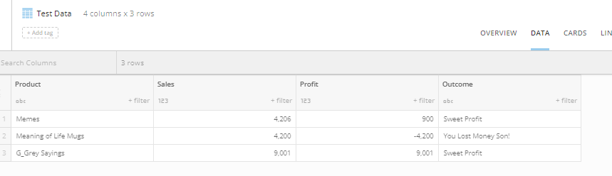
Here's my intimidatingly complex dataset
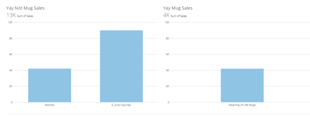
We have all been in this situation where we want to compare one card to another card... and here we are again. Usually it's for a more complex reason though other than arbitrary separation of cards. My CEO is going to be outrageously impressed with my bi swagger. As you can see mugs are our second best selling product.... Except wait.... no, they're not! One chart has an axis of over NINE THOUUSSSAANNNDD and the other one is less. Memes and Mugs sell almost the same amount.

What to do? Well, if I set a max on each chart's scale then if I want to filter on colors of mugs in my even more complex dataset that hypothetically exists here then the chart will look super squashed because the scale isn't dynamic anymore.
If there were functionality built to keep the axis's both in sync then the cards could work in tandum to tell a super powerful and interactive story. Bonus points if we can design linked drill paths so if you drill into one it drills the other linked cards as well.

Comments
-
Hello! I don't know if you've already solved this yet but I was having the exact same problem today and it took me to your post when I was searching for the solution. I'm glad that I'm not the only one who was running into the same problem!
Here is what I came up with:
First, I calculated Max Sales per Product then I added 100 to the Max Sales as shown below. ( I will explain why I added 100 later. You will see...hehehe)

On the Cards, I used Line bar and applied Max Sales to Y axis (No aggregation) and Sales to Series (Sum).

Then in the chart properties, I marked Hide Second Scale and Sync Value Scales in General.
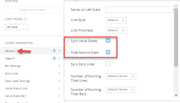
I also hid Landscape View Legend Position and Portrait View Legend Position.

Lastly, I changed the opacity of Max Sales of the color to ZERO so it would be invisible.

Apply this technique to all of the cards so they will be standardized.
However, this results in a small rendering bug as shown below. The invisible line is slightly visible on the tallest bar.
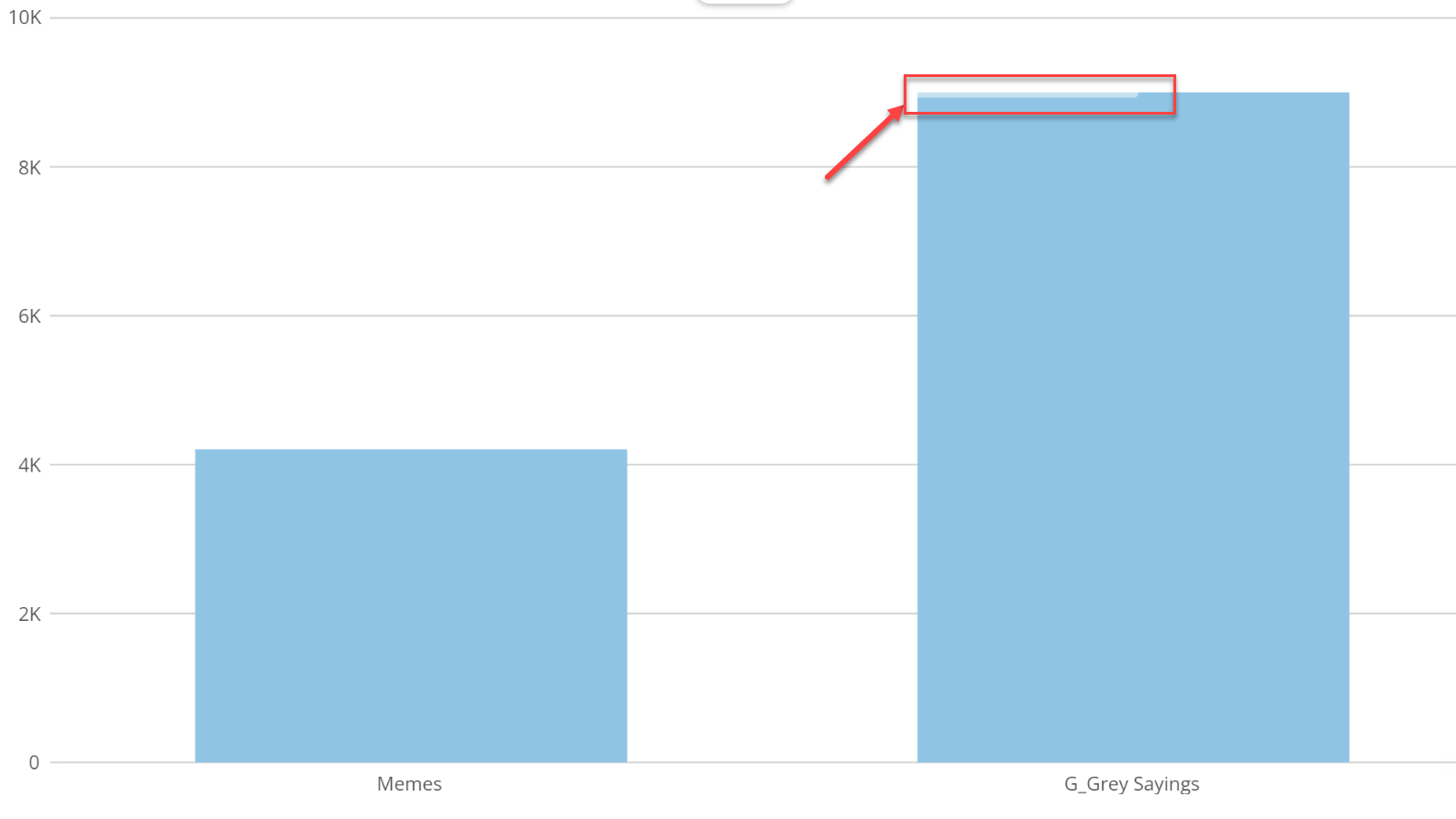
That is why I added a small number to the Max Sales (wink).
There is one thing that you need to be aware of. When you hover your house over the line, the value of the invisible line will appear. So don't move your mouse when you show this to your CEO. Your swagger will remain intact.

I hope this will be helpful. Or please share your ideas if you've solved it!
Thanks!
0

Categories
- All Categories
- Product Ideas
- 2.1K Ideas Exchange
- Data Connections
- 1.3K Connectors
- 309 Workbench
- 17 Cloud Integrations
- Data & ETL
- 2.3K Magic ETL
- 120 SQL DataFlows
- 667 Datasets
- Visualize & Apps
- 90 App Studio
- 198 Pro-code Components
- 2.6K Charting & Analyzer
- 873 Calculations & Variables (Beast Mode)
- AI & Data science
- 23 Domo AI & AI Chat
- 4 Managing AI
- 18 Jupyter Workspaces
- Automate
- 122 Workflows
- Alerts
- Distribute
- 118 Domo Everywhere
- 284 Reporting
- Manage
- 146 Governance & Security
- 489 APIs
- 11 Add-ins & Plugins
- 13 Domo Community Gallery
- 49 Product Releases
- 13 Domo University
- Community Forums
- 41 Getting Started
- 31 Community Member Introductions
- 118 Community Announcements
- 5K Archive