Aiit so here I am, I decided to go out on my own and describe the types of products at my company. We sell Mugs and... Not... mugs

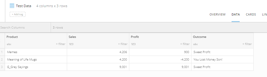
Here's my intimidatingly complex dataset
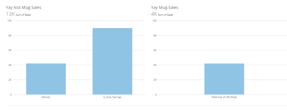
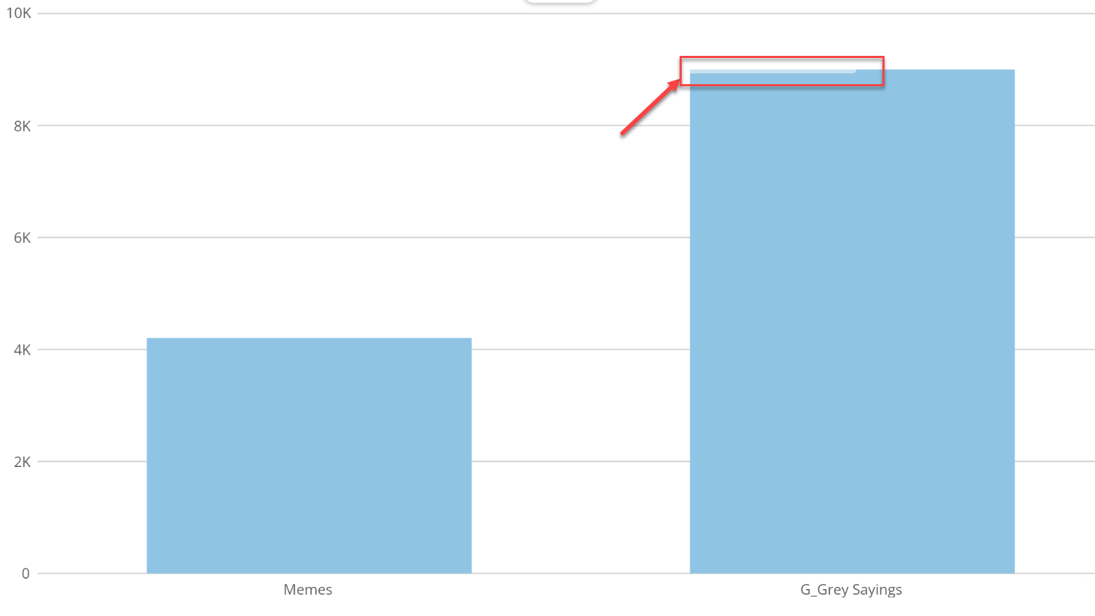
We have all been in this situation where we want to compare one card to another card... and here we are again. Usually it's for a more complex reason though other than arbitrary separation of cards. My CEO is going to be outrageously impressed with my bi swagger. As you can see mugs are our second best selling product.... Except wait.... no, they're not! One chart has an axis of over NINE THOUUSSSAANNNDD and the other one is less. Memes and Mugs sell almost the same amount.

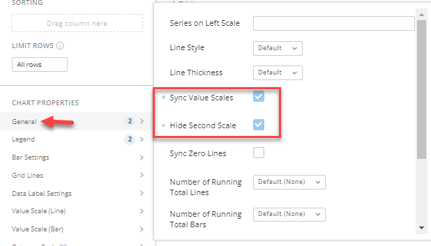
What to do? Well, if I set a max on each chart's scale then if I want to filter on colors of mugs in my even more complex dataset that hypothetically exists here then the chart will look super squashed because the scale isn't dynamic anymore.
If there were functionality built to keep the axis's both in sync then the cards could work in tandum to tell a super powerful and interactive story. Bonus points if we can design linked drill paths so if you drill into one it drills the other linked cards as well.