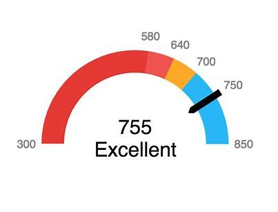
gauge with custom tick marks with values showing

Its possible I am missing it, but I went through all the gauges and settings and did not see how to do this:
1) a gauge with visible numbers for the tick marks
2) Tick marks that are custom values (ideally supplied in the data set, but even manually entered in the settings would be fine)
The idea would be to see the tick marks showing the quota value by quarter. The radial was the closest I saw with its ranges, but there is not distinguishing mark on the radial showing the ranges or any ability to show the value.
I attached some examples from other analytics tools that show the kinds of output I am talking about.
Thank you
u
Comments
-
That is interesting that there isn't an option to do that. I would suggest submitting this in the Ideas Exchange in the Dojo to have them add this in the future.
One workaround would be to use the Summary Number area to explain what the colors represent. You can write a Beast Mode that will allow you to select as a field in the summary number fields.
**Check out my Domo Tips & Tricks Videos
**Make sure to any users posts that helped you.
**Please mark as accepted the ones who solved your issue.0

Categories
- All Categories
- 1.4K Product Ideas
- 1.4K Ideas Exchange
- 1.4K Connect
- 1.1K Connectors
- 278 Workbench
- 4 Cloud Amplifier
- 4 Federated
- 2.7K Transform
- 89 SQL DataFlows
- 557 Datasets
- 2K Magic ETL
- 3.3K Visualize
- 2.3K Charting
- 571 Beast Mode
- 11 App Studio
- 28 Variables
- 579 Automate
- 141 Apps
- 414 APIs & Domo Developer
- 23 Workflows
- 1 DomoAI
- 28 Predict
- 12 Jupyter Workspaces
- 16 R & Python Tiles
- 352 Distribute
- 92 Domo Everywhere
- 258 Scheduled Reports
- 2 Software Integrations
- 92 Manage
- 89 Governance & Security
- 9 Product Release Questions
- Community Forums
- 42 Getting Started
- 28 Community Member Introductions
- 88 Community Announcements
- 4.8K Archive