Sankey Improvements

1) Allow more node width
2) Allow color control
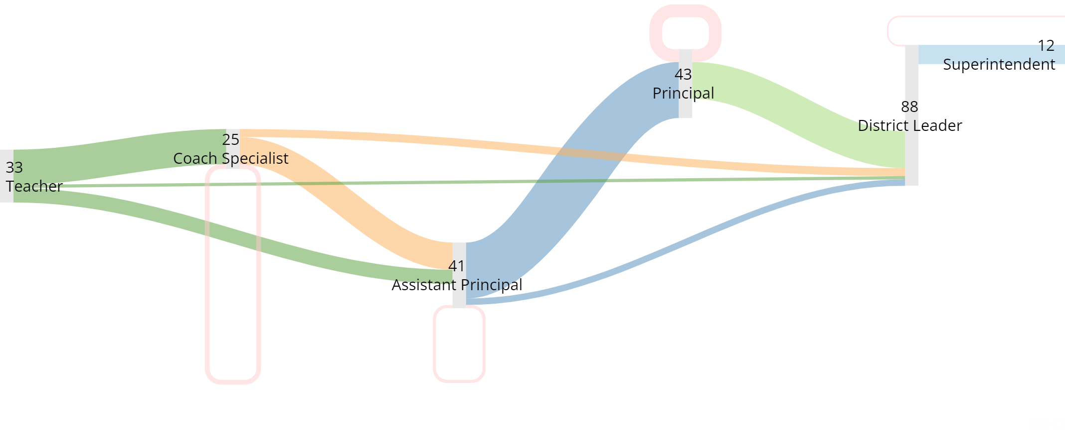
There does not appear to be a way to fully display a Sankey diagram that is more than 5 nodes wide without it getting cut off. Here's what it looks like cut off (with no way to get a non cut-off image)
It is also impossible to specify what colors you want associated with each path, and there's no way to change the color of the circular paths.
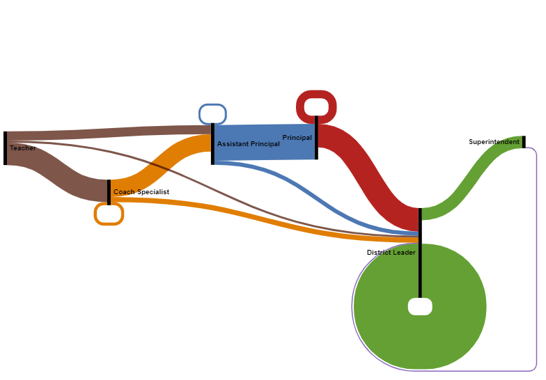
And here's the same graph using RawGraph. note that 6 nodes are not too cramped to fit, and the circular paths having the same color as the path they came from makes them easier to interpret.
Please 💡/💖/👍/😊 this post if you read it and found it helpful.
Please accept the answer if it solved your problem.
Comments
-
Originally, I thought it was because my chart had two many nodes, but even after restructuring so I only have 2 nodes, it's still cutting off the right side of my chart
Please 💡/💖/👍/😊 this post if you read it and found it helpful.
Please accept the answer if it solved your problem.
0
Categories
- All Categories
- 1.4K Product Ideas
- 1.4K Ideas Exchange
- 1.4K Connect
- 1.1K Connectors
- 278 Workbench
- 4 Cloud Amplifier
- 4 Federated
- 2.7K Transform
- 89 SQL DataFlows
- 557 Datasets
- 2K Magic ETL
- 3.3K Visualize
- 2.3K Charting
- 571 Beast Mode
- 11 App Studio
- 28 Variables
- 579 Automate
- 141 Apps
- 414 APIs & Domo Developer
- 23 Workflows
- 1 DomoAI
- 28 Predict
- 12 Jupyter Workspaces
- 16 R & Python Tiles
- 352 Distribute
- 92 Domo Everywhere
- 258 Scheduled Reports
- 2 Software Integrations
- 92 Manage
- 89 Governance & Security
- 9 Product Release Questions
- Community Forums
- 42 Getting Started
- 28 Community Member Introductions
- 88 Community Announcements
- 4.8K Archive