Best Of
Domo Quarterly Newsletter: July 2026
Hi Everyone! Just sharing the news about the drop of the new Domo Customer Newsletter you can find on the Domo.com blog:
Domo Quarterly Customer Newsletter: July 2026
Wanted to throw the link in here so everyone can go take a look at a recap of the latest Domo events product releases, a customer spotlight, and more.

Re: Fix the buggiest card type in Domo: The Text Card
@ColemenWilson have you heard from Product on this in a while? You are so right (still), this card type is rough. It could be so much better!

Re: Filter Selection not working
I'd recommend logging a ticket with Domo Support as this sounds like a bug within Domo and they'd be the best resource to help with the issue.

Is the SQL Tile in Magic Broken?
I have seen multiple ETLs with SQL Tiles fail inexplicably with no changes to the ETL or underlying data. These ETLs have been running successfully for weeks or months. Is anyone else seeing this?
I first noticed this yesterday (6/15) around 3:40pm eastern
I have submitted a ticket, but I need to escalate here as this is base level functionality.

Re: April Community Forum Recap
He says he was hiding because he didn't want to surpass someone else on the all-time scoring list. ;)

Card Limitations
It has been 49 business days since @DavidChurchman posted what I consider the most significant forum discussion of 2026. And since then, I don't think a day has gone by where I don't realize I am limited by Domo cards.
The chart below is a mock-up. The numbers in the image are fake.
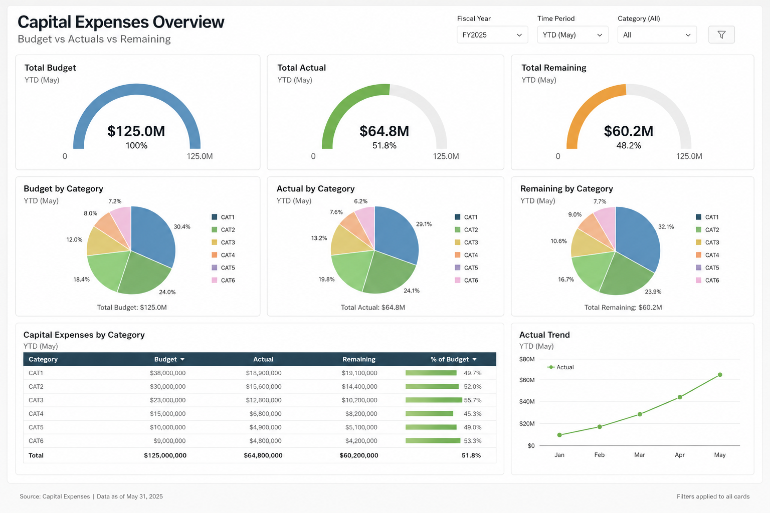
Challenge - can you replicate this with Domo cards - no blank bricks, no AI, as shown?
- Gauges are half circle, start at zero.
- Each gauge has a currency amount and a percent beneath it.
- Every slice (in the pie charts) show a label - even small slices
- Each pie chart has a total at the bottom and a legend on the side.
- Table chart has a horizontal bar on last column.
- Simply line chart with node (dot) at each reference point
Sample data would be something like
Fiscal Year | Category | Measure Type | Amount |
|---|---|---|---|
FY2025 | CAT1 | Budget | 35000000 |
FY2025 | CAT2 | Budget | 28000000 |
FY2025 | CAT3 | Budget | 24000000 |
FY2025 | CAT4 | Budget | 18000000 |
FY2025 | CAT5 | Budget | 15000000 |
FY2025 | CAT6 | Budget | 5000000 |
FY2025 | CAT1 | Actual | 12000000 |
FY2025 | CAT2 | Actual | 8000000 |
FY2025 | CAT3 | Actual | 24000000 |
FY2025 | CAT4 | Actual | 15000000 |
FY2025 | CAT5 | Actual | 3500000 |
FY2025 | CAT6 | Actual | 2300000 |
FY2025 | CAT1 | Remaining | 23000000 |
FY2025 | CAT2 | Remaining | 20000000 |
FY2025 | CAT3 | Remaining | 0 |
FY2025 | CAT4 | Remaining | 3000000 |
FY2025 | CAT5 | Remaining | 11500000 |
FY2025 | CAT6 | Remaining | 2700000 |

Re: April Community Forum Recap
Congrats to All!! Weird to see the leaderboard absent of our resident viking, @ArborRose ?!?

PDF Report Builder Beta: Pass a user-controlled filter to the report?
Has anyone figured out a way to pass the filter selections made by users on an App Studio page to the new PDF report? I like the ability to format the PDF, but ideally, I'd be able to have a user filter for the data they care about, and then use a button to "Export to PDF", which would then export the nicely formatted report for the data they care about. It's not practical or me to create a different view/button for every filter selection.