Best Of
Re: How many X did we do in Y?
This is the part of your answer I'm most curious about:
I've worked for several Domo customers and have tried to conduct these sort of experiments with varying degrees of success.
That's the sort of thing I look for when I try to discern AI-hype from AI-reality. Has the person advocating this AI tool used it in the real world, and if so, what were the pitfalls? When someone only talks about the upside, I start to get skeptical fast, because the downside can be pretty tremendous in action. I'd love to hear more about your experiments: what worked about them, and what are the pitfalls we should avoid?
I think you asked me two questions in your post, and their answers are interrelated for me. 1) Why do I think incorporating AI will hurt my relationships with stakeholders. 2) Can the data pie get bigger if I incorporate AI? (Maybe these were asked rhetorically to the broader audience, but I'll try to answer them anyways).
To start with, I'll ask my own two (rhetorical) questions: What is the number one way to lose trust with stakeholders? Bad data. Is it easier to build trust from scratch or rebuild trust after it has been broken? Build it from scratch.
So, why do I think incorporating AI will hurt my relationships with stakeholder? Because it is an unstoppable spigot of bad data. I generally know how to validate and present clean, reliable data, but I do not know how to validate every conceivable response to an AI chatbot based on my data. And I don't believe anyone can, but I am trying to keep an open mind to it eventually being possible. The risks of someone asking an AI chat bot a question and getting a bad answer are not zero. Trust is my most important asset, and I don't risk it lightly.
Do I believe that the data pie can get bigger if I incorporate AI? Surely, but I'll ask yet another rhetorical question: is a bigger pie always better? We served individual-serving pies at my wedding (neither my wife nor I like cake). I'd much rather my data looks like one of those carefully constructed pastries presented artfully by hand than a series of ample warm cowpies, dropped indiscriminately across my field. Are there opportunities that I'm missing by failing to wade through fields of muck? (Or in this scenario, serving up the field of muck to stakeholders). Possibly. Probably. But, for now, I feel more inclined to laboriously scale up my edible pies by hand than to scale up everything first, assuming I'll figure out how to make my giant pies edible later.

Re: There is no Line Label setting for Symbol Line Chart?
They likely were developed independently of each other. This would be a great idea for the idea exchange to recommend the Domo team implement and allow other users to vote on this.

Re: Taking an average of the dataset an comparing
@damen Made you a little video I hope this is what you need:
The issue is you might want to use a variable instead of a dropdown filter because if you use a filter you are taking data out of the chart which is ruining the average.
https://www.dashboarddudes.com/newsletter-sign-up

Re: Enhance PDP to Allow SQL Filtering
take your dataset and UNION it.
select vendor, amount from table as A
union
select "Total" as vendor, sum(amount) from table as b
then PDP policie includes Vendor = a and vendor = Total

Re: Domo Connections 2026: What do you hope to see?
Speaking for myself:
I haven't attended one yet (I'll make it happen this year), so keep that in mind.
For AI, we are all comfortable "using" AI via chat bots and the occasional agentic deployment. But I struggle with actually putting AI to it's full potential. The answer seems to be "Use AI!" for lots of questions right now, but I don't know the first step towards actually making that happen.
My 2 cents on networking: If you advertise "networking", I'll probably run away. But if you create an event where networking happens by nature of the event itself, then it's a win. I think y'all did a great job at TopGolf for DP this year. Make something fun that people want to go to, and then networking/connections will happen naturally

Re: How many X did we do in Y?
Maybe AI is the answer, but I find it interesting no one is saying they have successfully used AI to do this, just that it seems like AI should be good for this.
Each ad hoc data request is an opportunity to learn and build connection. What are your stakeholders curious about? Why can’t your current views answer the questions being asked? Is it really a one-off question, or something that will get asked again every week/month/quarter? Let’s say that the AI assistant can answer these questions (would love to hear someone was successfully getting value out of it, not just in theory), I would be wary of missing out on those opportunities to learn from and build relationships with my stakeholders.
Re: How to show user what columns they are sorted by?
Mega-Tables have arrows/numbers that show which columns are sorted:
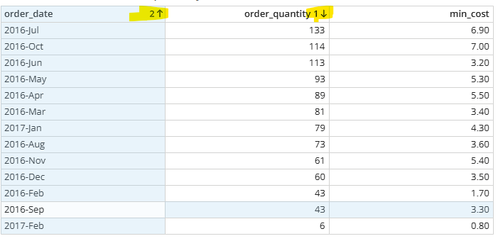
Are you talking about something in addition to that?
Duplicating a Dashboard into App Studio Breaks Cards & Re-adds Previously Removed Cards
I'm running into a consistent issue when importing a dashboard into a Domo App Studio app using the "Duplicate Cards" option during import.
Steps to reproduce:
- Go to an App Studio app → Pages and navigation → Order tab → Import > Dashboard
- Select an existing dashboard and check "Duplicate Cards"
- Complete the import
Issue 1 — Broken cards:
Some cards do not import correctly. They appear broken/non-functional in the app after duplication, even though they display fine on the original dashboard.
Issue 2 — Phantom/removed cards reappear:
Cards that were previously removed from the source dashboard (no longer present on it) still get pulled into the app during the duplicate-import process, as if Domo is referencing an old/cached version of the dashboard rather than its current state.
Workaround found:
When I import the same dashboard without duplicating (leaving "Duplicate Cards" unchecked, so the app links to the original cards instead of creating copies), the import works perfectly — no broken cards, no phantom cards.
Questions:
- Is this a known caching issue with the duplicate-on-import process specifically?
- Is there a recommended workaround for duplicating cards into an app while preserving reliability (e.g., "Save As" the dashboard first, clean it up, then import that instead)?
- Is this related to dashboards that have page filters/variables at the top? (I've seen a similar report from another user where duplication broke down specifically on dashboards with variables.)
Any guidance from Domo staff or others who've hit this would be appreciated.

Re: How many X did we do in Y?
You could try and leverage Domo's AI capabilities to allow users to ask their questions and get answers.
Re: How many X did we do in Y?
@Data_Devon have you looked at the AI chat feature + AI dictionary on core datasets? I believe they just made an update to AI chat last month that has significantly improved its responses and also allows it to use datasets that aren't in context.
 ellibot