Best Of
Can we please have a better way to work with drilldown cards?
Working with Drilldowns is far too arduous at present.
Could an option be added within Analyzer for example to create and edit the drilldowns? It would be much more intuitive than the existing approach which requires entering edit mode and then multiple clicks to access the drilldowns.
It would also be great to expose the drilldown cards in the Cards area. They are currently too hidden and when trying to govern the environment that's not good!
Feels like this could be a simple enhancement!
Thanks
 TC777
TC777
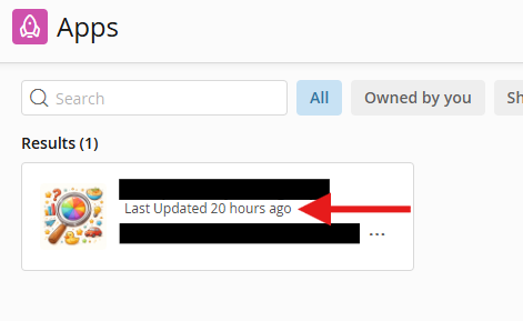
Option to hide "Last Updated" date on App Studio Apps Page
I have received feedback from some users that they would like to have the option to hide the "Last Updated" date that shows on App Studio apps.
Some users will be getting confused by that value, as it may cause them to think that the data powering the app has not updated since the time shown, while the actual value that it is displaying is the last time the app itself was updated (i.e. layout or logic was updated).
The desired functionality that was requested is the ability to toggle that display value on and off at an administrative level, to sidestep potential user confusion.
Collapsible App Sections
Revisiting a highly upvoted idea from several years ago, is it possible to have collapsible sections within an app page? The tabs feature is awesome and a huge step-forward but there are still cases where collapsible sections would work better and reduce clutter on busy pages improving the end-user experience.
TC777
Grant access directly from request
I get a notification in Buzz whenever someone new requests access to one of my cards. It would be nice to have a single click approve/reject option living within that notification.
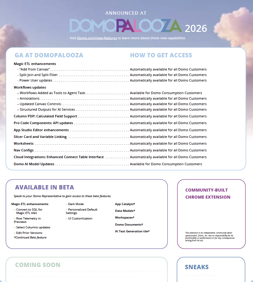
March 2026 (Domopalooza) Customer Feature Release
Hard to believe we are a week out from Domopalooza. We of course will have a bunch of new goodies releasing next week. You will see in product announcements soon as well but sharing a list of what is coming here for now (Sneaks and Coming soon will have to wait for the big stage at DP).

Support for pfilters' persistence across Pages in AppStudio
In App Studio, pfilters applied via the URL do not persist when navigating between pages (persist page filters setting is ON) , as the URL modifier is dropped upon page changes. Currently, persistent page filters are supported only when the filters are applied via the App Studio UI persist across pages.
Decouple Grants + more grant granularity/control (specifically with Report Builder)
There is an existing Ideas Exchange that talks about decoupling the required Manage All Pages grant from Share Pages, especially for view only environments here: https://community-forums.domo.com/main/discussion/65849/more-grants?utm_source=community-search&utm_medium=organic-search&utm_term=grant+decoupling
I'd like to add that we need more of that granularity with Report builder which requires both Edit Pages AND Edit Apps, which for a view-only environment, would require a publish refresh if users were to delete a page/app which would be disruptive to the other users in their instance.
Ideally, more granularity for grants (and less of the required implicit grants) across the board would cover many customer use cases especially where instances don't have the entire Domo feature set enabled.
 brookg
Fixed Tiles or sections for filters
In app studio, it would be so good if you could put a fixed tile or section on the side that stays fixed when you scroll. So you can scroll through cards etc but always have visibility of the filters you've applied
Add UPSERT to NetSuite SuiteAnalytics Connect Connector
For high-volume NetSuite environments, full dataset refreshes create significant performance. Adding UPSERT support to the NetSuite connector would allow incremental updates of transactional data, drastically reducing refresh times, and scalability limits. This feature is critical for customers pulling millions of NetSuite records and would enable Domo to better support enterprise-scale NetSuite analytics use cases.
Feature Request: A3 PDF Export for Domo Campaigns
We’d like to request support for exporting Domo Campaigns dashboards as PDFs in A3 format.
Many users expect dashboards to be shareable in larger page sizes, especially for email distribution and presentations. A3 export would allow dashboards to retain proper layout, readability, and formatting, eliminating scaling and layout issues that occur with smaller PDF sizes.
This enhancement would significantly improve how Campaigns dashboards are shared and consumed outside of Domo.
Rajesh_K