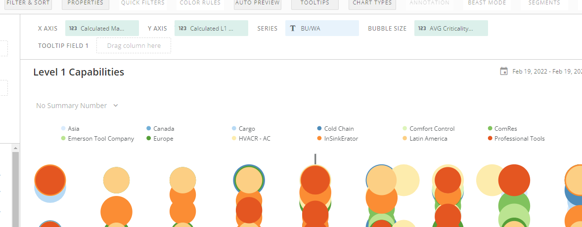
I've built a scatter chart and am having an odd issue with some weird noise at the top of my legend... This appears to be the result from putting a Tooltip value for data labels. And it makes the chart look very amateurish.
Can anyone advise on this?
See screenshots below. The first shows the issue I'm having...

And this one is when I remove the tooltip value (which clears up the clutter, but unfortunately disables me from incorporating data labels).