Alright, so picture this. Your CEO wants to know if you're hitting goal and who is and is not contributing to the team so that he can deliver high praise or the ultimate corporate smack down.
Should be a simple enough task. Here's your table:

But then you go to a bar / symbol chart and you gots yourself an issue! You can only have one measure and a series....

A solution is you could simply make your dataset way more complicated than it needs to be by adding a bunch of calculated columns

When all we really need to answer this simple question is some functionality that allows you to do a bit of both. My dream would be for the chart to work like this and then I could spend my morning doing what I originally planned to do -- commandeering a ship, picking up a crew in Tortuga, then raid, pillage, plunder, and otherwise pilfer my weaselly black guts out.

Come to think of it... One more thing!

Do you know the mental impact and supreme joy that seeing bars punch through lines brings to executives hearts? You want to rock their world? Add a line option to the bar/symbol chart. Seriously to you it may look like dis:
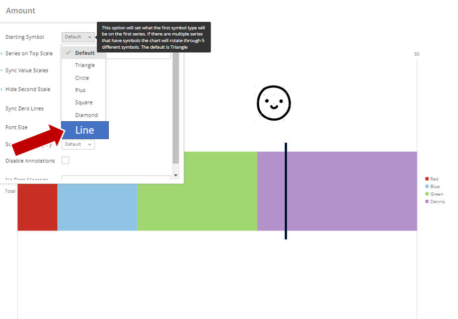
But to them it looks like this: