New 'Journey Visual' suggestion
G_Grey
Contributor

in Other Ideas
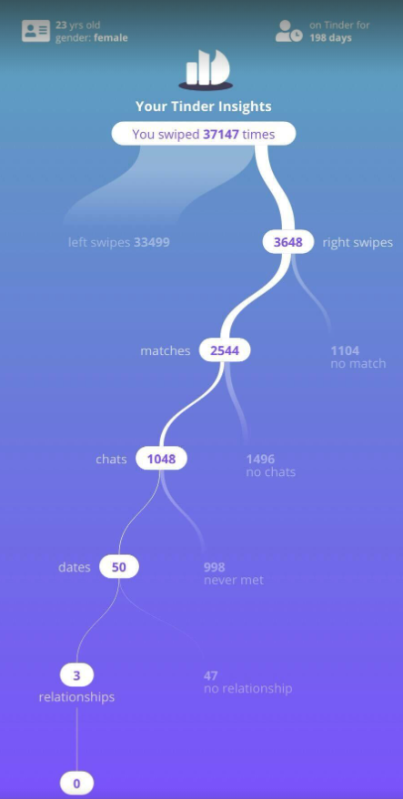
In my random internet browsing adventures I've noticed that Tinder has released this visualization that their users are going nuts sharing that basically maps their consumer journey with their platform.
This chart looks very "sankey esque", but it allows the journey to end and it allows more levels of detail.
I can think of several uses for a chart like this.... one of the top of mind ideas being able to track what buying behaviors customers follow during their 1st, 2nd, 3rd, n.... purchase and exactly when they stop making purchases.
It's powerful, it's informative, it's mobile friendly, it's detailed. Would love to be able to build a story similar to this in DOMO.
Tagged:
4
Categories
- All Categories
- 2K Product Ideas
- 2K Ideas Exchange
- 1.6K Connect
- 1.3K Connectors
- 311 Workbench
- 6 Cloud Amplifier
- 9 Federated
- 3.8K Transform
- 657 Datasets
- 115 SQL DataFlows
- 2.2K Magic ETL
- 815 Beast Mode
- 3.3K Visualize
- 2.5K Charting
- 81 App Studio
- 45 Variables
- 775 Automate
- 190 Apps
- 481 APIs & Domo Developer
- 81 Workflows
- 23 Code Engine
- 40 AI and Machine Learning
- 20 AI Chat
- 1 AI Playground
- 1 AI Projects and Models
- 18 Jupyter Workspaces
- 410 Distribute
- 120 Domo Everywhere
- 280 Scheduled Reports
- 10 Software Integrations
- 144 Manage
- 140 Governance & Security
- 8 Domo Community Gallery
- 48 Product Releases
- 12 Domo University
- 5.4K Community Forums
- 41 Getting Started
- 31 Community Member Introductions
- 114 Community Announcements
- 4.8K Archive