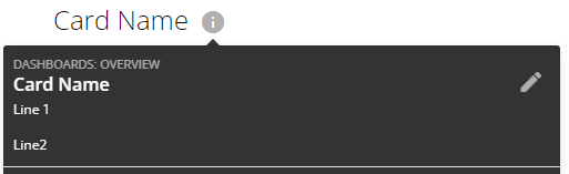
When building dashboards, we can write text boxes and things that help explain what charts are telling us... but that's often only needed the first few times a dashboard is read, after that it becomes cluttered.
It might be useful if we had an information icon that would bring up a pop up box explaining the chart.
For example in this poorly explained chart, G_Grey said that in March we made $100,000 off of sassy hats and domo themed clothing.

Big brained business leaders threaten to light my beard on fire when they see this chart only shows the number 10,000 for March, not 100,000. All of this beard fire could be easily avoided if I simply had a button on a card that would pop up some sort of window that would describe what the chart is showing them.

Save the beard, empower the people, build a happy little info button.