At the CST time of this posting, I had a far out idea – what if colors were a little more flexible in a couple of ways. Here’s a few ideas.
Today when changing colors on a visual, this fun experience occurs:

The change all button doesn't even have a warning before it causes the mass extinction of the other carefully designed cards colors! The results, in my experience is dashboards changing more times in a month than The Doctor (Doctor Who) changes actors throughout the show's history:

What makes it infinitely more entertaining is the reaction of the business users, especially the ones that are extremely particular about the color of their reports --- it's always the same story but it never gets old:

Anyway, if DOMO were to implement some functionality similar to the below image then three things would happen --
1.) Resources spent rebuilding color rules that will be yeeted into oblivion faster than an Elon Musk taking over his favorite bird website would no longer be a concern
2.) All the fun conversation that comes from the business when button roulette occurs would go away
3.) DOMO Dashboards in general would look even better because there would be more safety that work would be preserved so I think the developer base would spend more time making their visuals look exceptional

Being able to save multiple sets of color rules to datasets and being able to apply them to cards. That would be the dream.
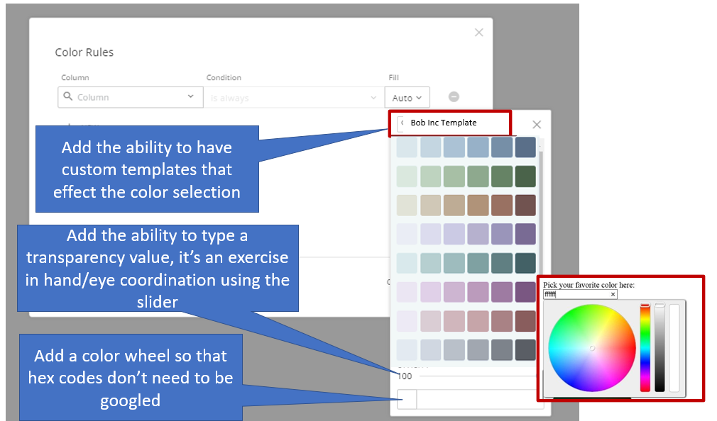
Next topic, the color selection -- I think it's great that we can use a hex code to select any color... there are three things that would help us make even better happy little visuals

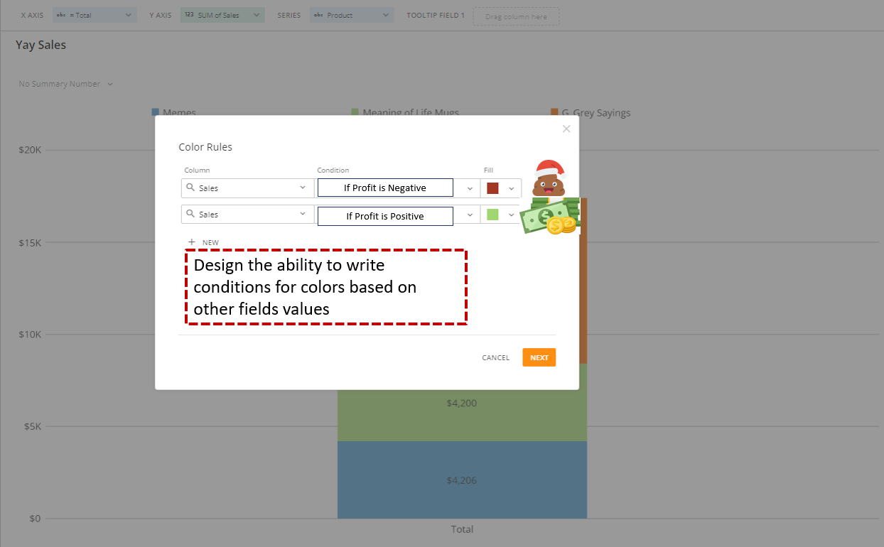
The next thing on my mind that would make our dashboards stickier than Coke and Mentos is setting color rules for fields that are calculated based on other fields. There are work arounds to this, but I'd want to use this in a more complex manner.
HERE is the ultimate chart and the dataset that goes with it. The company made $17k in Sales we hit our goal. Let's celebrate!

Guess what? The 4.2k in mugs lost tons of money. Which isn't good for the company... Every party needs a pooper that's why they invited G_Grey! Let's make those Sales Green if Profit is positive and brown if Profit is down, thanks the meaning of life mug.
One final thought -- has there been any thoughts around 'chart themes' or additional color schemes. Sometimes, when making visuals that compare 'this year' vs 'last year' for example I can differentiate them with lighter colors or darker colors, and with opacity... but having different outlines or fill types (such as cross hatching or gradients) here's a few simple example:


Merry Christmas, I'm off to paint my dashboards with all the colors of the wind.