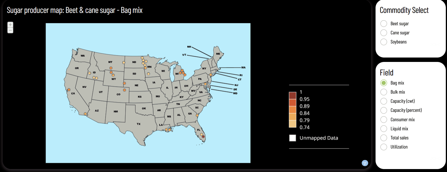
App studio framework is a big upgrade for our company from Dashboards when it comes to styling. One thing however that we encountered is that when a card is expanded, customization options are limited. Until recently, the expanded image would be the same format as the 'Card Details' page of a particular card, like so (an example card we're working on):
Recently (early September), a change was made in app studio such that the background of an expanded card would be set to be the same as that card's style in the app. Ex.
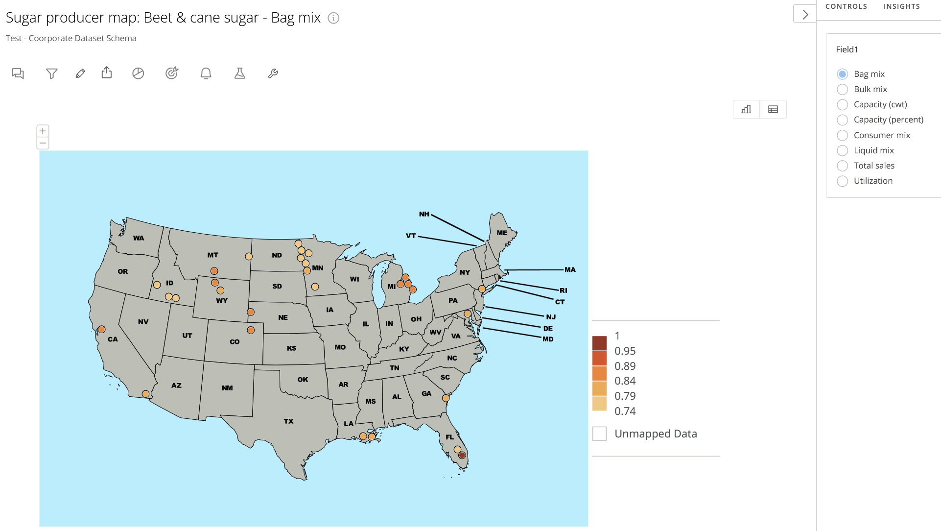
(View in app):
(View in expanded card):
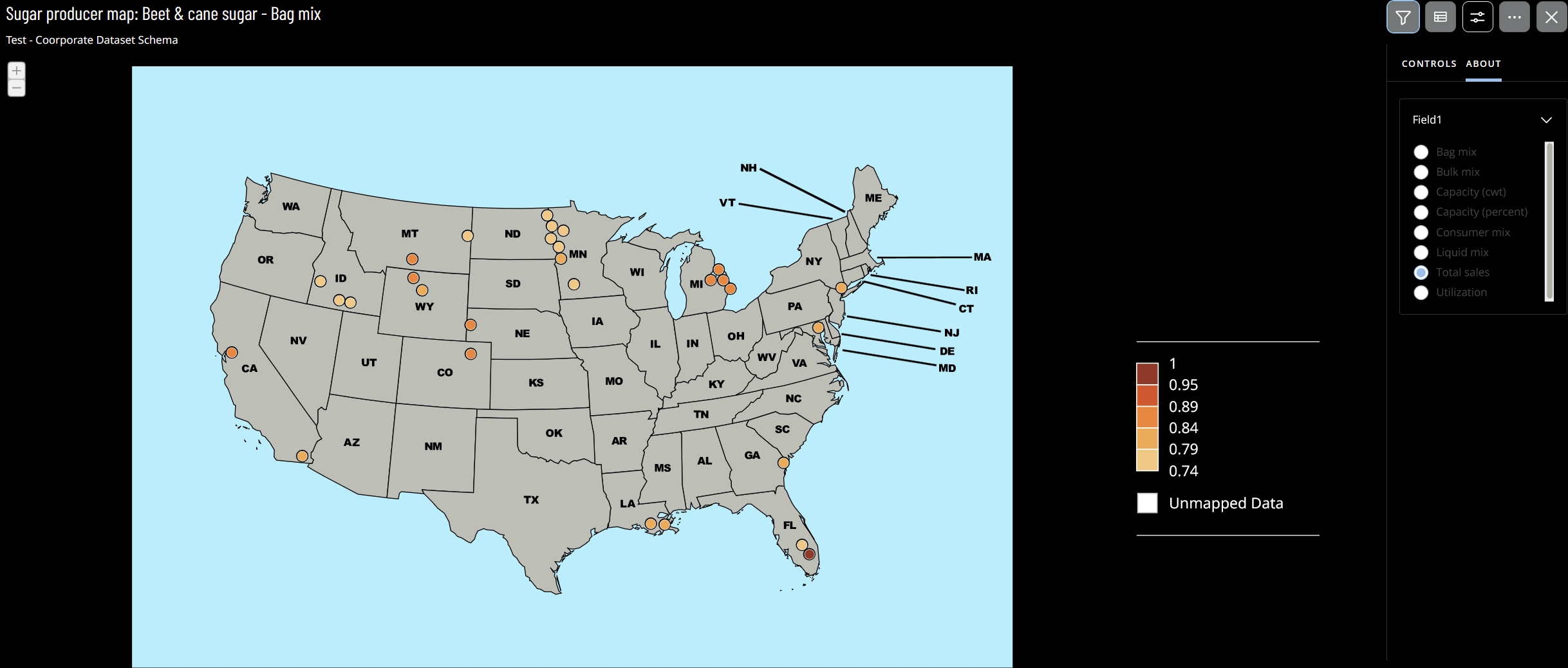
However, you can see in the screenshot that controls have a problem here in that they retain the font color of how they appear in the 'Card Details' page. This makes it so that on a black background, the text is difficult to read.
In this case, having the option to customize control font color in an expanded card (or a mechanism to change the font color to white or dark grey depending on the background) would be a good fix (believe me we've tested a lot in app studio styles and this isn't a customization option).
However on a larger scale, having additional control over how an app looks when expanded is an area untapped so far in Domo's development history. It could be a style in itself to not change, but overwrite when displaying in an app the chart properties of a card. For example, a card specifies the legend on the bottom of its layout, but an app style could be set such that when the card is in an app, the legend appears on the right hand side. It'd also be nice to display specific configurations for controls for cards in apps similar to how they appear on an app. For instance, in the two screenshots above, the control's name in the app was changed to be 'Field', but internally we use codes to create variables and specify their use. When the card is expanded, 'Field1' is displayed, it's code (this field is used for testing), but we would like 'Field' to be displayed instead. What do you all think?

