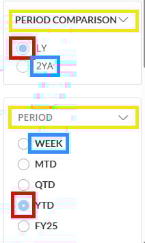
When viewing Quick Filters on a card, the visual design of a selected radio button is different for a variable than a data column or beast mode filter. I would like them to be the same format.
I also would like the filter titles to have the same font format. Variable quick filter titles are a darker color than data column or beast mode filter titles.
More subtly, the items in the radio button filter list also have different font format for variables, with the items being slightly lighter in color than the items in a data-based filter list.