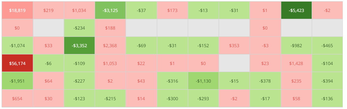
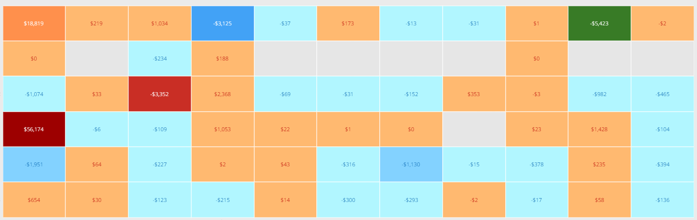
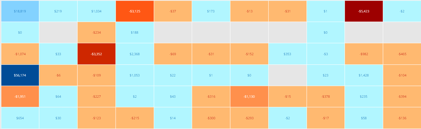
The basic Mega Table card has come a long way from when it was first released. One of these improvements has been the ability to color the columns as a heatmap (with lots of other settings within). In the card details page, it is basically a perfect implementation. However, when you put your card into AppStudio, it automatically assumes you want to use your theme colors and overwrites the more logical, red/green color palette that so many users know and love. Depending on the them of your app, you can get all sorts of illogical colors that don't tie back to the actual data you are showing. Down -8% YoY?, sure lets make that dark green.
I'd love a checkbox or some other functionality that allows you to 'lock' the colors of your table (including heatmap) instead of overriding with the appstudio them colors.