How do I format?

Hi all,
I am working to generate a report but am not sure how to calculate in Domo to get the visualization right
Right now, we are looking a property type breakdown by year - included on the y-axis is the number of loans we had each year.
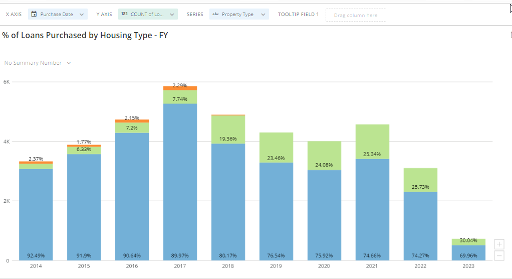
We are trying to keep the years on the x axis but only show the property type breakdown as a percentage similar to this where each year's percentages adds up to 100%

When I change the x-axis to a property type field, I am getting a count of all the property types that are filled out in our data

How do I create a field where everything adds to 100% but also show the breakdown of each property type? Do I need to create a beast mode? What functions do I need to use?
If this helps, feel free to agree, accept or awesome it!
Answers
-
You can keep your y-axis as count, but change your chart type to the 100% stacked bar. It is found under the vertical bar chart type. This will get your items to add up to a 100%.
 **Check out my Domo Tips & Tricks Videos
**Make sure to any users posts that helped you.
**Please mark as accepted the ones who solved your issue.3 -
@MarkSnodgrass Simple enough. Thank you sir.
If this helps, feel free to agree, accept or awesome it!
1

Categories
- All Categories
- 2K Product Ideas
- 2K Ideas Exchange
- 1.6K Connect
- 1.3K Connectors
- 311 Workbench
- 6 Cloud Amplifier
- 9 Federated
- 3.8K Transform
- 660 Datasets
- 117 SQL DataFlows
- 2.2K Magic ETL
- 816 Beast Mode
- 3.3K Visualize
- 2.5K Charting
- 84 App Studio
- 46 Variables
- 778 Automate
- 190 Apps
- 482 APIs & Domo Developer
- 83 Workflows
- 23 Code Engine
- 41 AI and Machine Learning
- 20 AI Chat
- 1 AI Playground
- 2 AI Projects and Models
- 18 Jupyter Workspaces
- 412 Distribute
- 120 Domo Everywhere
- 281 Scheduled Reports
- 11 Software Integrations
- 145 Manage
- 141 Governance & Security
- 8 Domo Community Gallery
- 48 Product Releases
- 12 Domo University
- 5.4K Community Forums
- 41 Getting Started
- 31 Community Member Introductions
- 115 Community Announcements
- 4.8K Archive