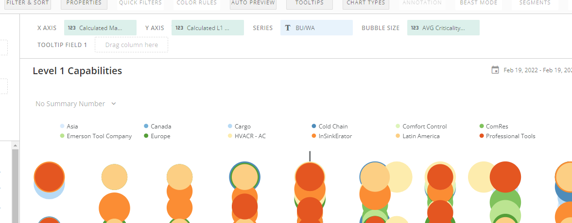
Issues with cutoff characters at top of series for scatter chart
I've built a scatter chart and am having an odd issue with some weird noise at the top of my legend... This appears to be the result from putting a Tooltip value for data labels. And it makes the chart look very amateurish.
Can anyone advise on this?
See screenshots below. The first shows the issue I'm having...
And this one is when I remove the tooltip value (which clears up the clutter, but unfortunately disables me from incorporating data labels).
Answers
-
This appears to be a display bug. I’d recommend reaching out to support and logging a case with them.
**Was this post helpful? Click Agree or Like below**
**Did this solve your problem? Accept it as a solution!**0 -
Does the issue persist when you save the card and view it outside of Analyzer? Either way, here are a couple options for you.
In the Data Label Settings, you can toggle the Allow Overlap checkbox and see if that helps.
Use the Hover Text Settings instead of the Data Label Settings. You can have multiple fields of information in there and separate things into different lines, which will result in a cleaner look and people will see the information when they hover over a dot.
**Check out my Domo Tips & Tricks Videos
**Make sure to any users posts that helped you.
**Please mark as accepted the ones who solved your issue.1 -
Yes, it persists outside of analyzer... I tried the options you suggested to no avail. I'll open a support ticket.
0
Categories
- All Categories
- Product Ideas
- 2.1K Ideas Exchange
- Connect
- 1.3K Connectors
- 309 Workbench
- 7 Cloud Amplifier
- 10 Federated
- Transform
- 666 Datasets
- 120 SQL DataFlows
- 2.3K Magic ETL
- 827 Beast Mode
- Visualize
- 2.6K Charting
- 90 App Studio
- 46 Variables
- Automate
- 198 Apps
- 489 APIs & Domo Developer
- 97 Workflows
- 24 Code Engine
- AI and Machine Learning
- 23 AI Chat
- 4 AI Projects and Models
- 18 Jupyter Workspaces
- Distribute
- 118 Domo Everywhere
- 284 Scheduled Reports
- 11 Software Integrations
- Manage
- 145 Governance & Security
- 13 Domo Community Gallery
- 49 Product Releases
- 13 Domo University
- Community Forums
- 41 Getting Started
- 31 Community Member Introductions
- 117 Community Announcements
- 5K Archive


