Compressing bar charts (5 across) onto page

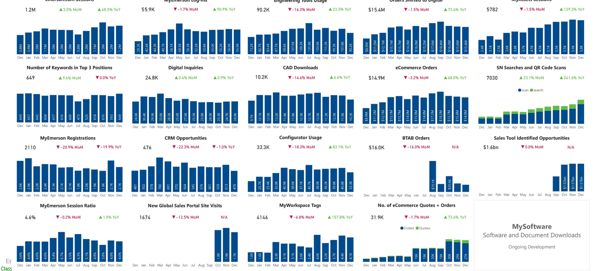
I have a request to essentially create an executive dashboard that will display a bunch of charts, primarily bar charts (going back 13 months), 5 across... Below is a screenshot of something that was created in Power BI.

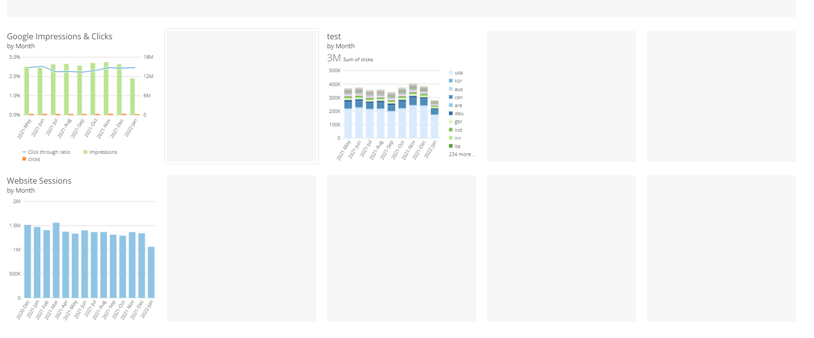
Is there a way to do this in Domo....?


Tagged:

Best Answer

  • MarkSnodgrass
    Answer ✓

    Yes, you can do this. If your page is set to a standard page, you can choose the small size card size and will allow you to put 5 in a row. If you are using the dashboard page layout, edit the dashboard and choose options and display mode and choose auto width. This will give you more screen real estate to put more cards in a row. You can then resize each card to make them fit in a row.

    **Check out my Domo Tips & Tricks Videos

    **Make sure to <3 any users posts that helped you.
    **Please mark as accepted the ones who solved your issue.

Answers

  • You'd need separate cards for each graph but you can put multiple charts side by side within a page. Essentially you'd have a page with 20 separate charts / cards on your page. You can resize the different charts to meet your needs on the page.

    **Was this post helpful? Click Agree or Like below**
    **Did this solve your problem? Accept it as a solution!**
  • MarkSnodgrass
    Answer ✓

    Yes, you can do this. If your page is set to a standard page, you can choose the small size card size and will allow you to put 5 in a row. If you are using the dashboard page layout, edit the dashboard and choose options and display mode and choose auto width. This will give you more screen real estate to put more cards in a row. You can then resize each card to make them fit in a row.

    **Check out my Domo Tips & Tricks Videos

    **Make sure to <3 any users posts that helped you.
    **Please mark as accepted the ones who solved your issue.

  • I'm still having issues... when I create a dashboard, it will cut out my X-axis values... I addressed by adjusting the Display Mode (in options when editing dashboard) to "Auto Width". This expanded the cards so I can see the X-axis values...

    However when I export the page, it cuts out the X-axis values. Is there a way to address this?

    Dashboard:

    Power point export:


  • Domo is working on enhancing the export process. I believe there is a beta feature that you can ask your CSM if you can be a part of to see if it will help. Right now, it is a little bit of trial and error. One thing you can do that might help is to turn off some of the display options on each card in your dashboard. If you edit your dashboard, you can click on edit content on each card and choose display settings and uncheck things like timeframe and summary. This might give more display area for your axis when exporting.


    **Check out my Domo Tips & Tricks Videos

    **Make sure to <3 any users posts that helped you.
    **Please mark as accepted the ones who solved your issue.
  • Thank you...

  • @MarkSnodgrass Can you tell me which beta it is you're referring to?

    My CSM just enabled a "Print Preview Beta" which shows page breaks.... is this what you're referring to? If so, it doesn't address my issue.

    Thanks,

  • @NathanDorsch yes that is the beta I was referring to. I was hoping it would include some features that would help you with this. That's a bummer that it does not. Are you finding that they have to be a certain size when exporting in order for the axis to show up? I'm not sure it helps with exporting, but the chart properties do have options for the label settings to always show instead of default. You might see if that helps.


    **Check out my Domo Tips & Tricks Videos

    **Make sure to <3 any users posts that helped you.
    **Please mark as accepted the ones who solved your issue.