Creating a Manager Span of Control Chart

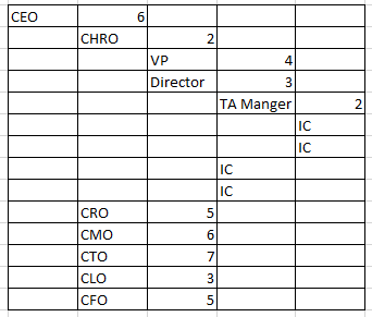
How would we go about creating a table that shows manager counts from the top down. For example the CEO has 6 Chiefs that report to him. The CHRO below the CEO has 2 direct report managers, who each have people they manage. How could we design a report that could start out from the top showing the CEO with a headcount of 6 that report directly to him. Click on him and see all 8 Chiefs with the total manager headcount under each one, then click the CHRO, see the manager headcount of 2, then click one of her managers and see that manager has a headcount of 3, and so on.
But the tricky part is that with each new employee the data needs to automatically refresh and place that new employee into the count for the correct manager, without having to manually add a field to that employee, or also to update if someone gets promoted to a manager position and now should be on that list. We tried something but only got it to show the counts of all managers, but then put all individual contributers as others and bunched them separately.
Something like this…
Best Answers
-
Are you requiring it to be in a tabular format? You could get something similar with a Sankey chart where you'd just need your data to have two columns:
Boss Title | Report Title
**Was this post helpful? Click Agree or Like below**
**Did this solve your problem? Accept it as a solution!**1 -
@lfielding I second @GrantSmith's suggestion about using a Sankey chart since it's designed for visualizing these types of relationships and would eliminate the need for so many clicks. You can still drill down to see specific names in a table format.
An alternative is to create a dataflow that joins employees of each level to their manager. However this method is fairly rigid since it requires a join for each level of boss-employee relationship, which could get challenging if levels are added or removed at any time
0


Answers
-
Are you requiring it to be in a tabular format? You could get something similar with a Sankey chart where you'd just need your data to have two columns:
Boss Title | Report Title
**Was this post helpful? Click Agree or Like below**
**Did this solve your problem? Accept it as a solution!**1 -
yes we would like it in a tabular format that would allow us to click through to different managers at different levels but ultimately be able to see all employees that directly report into a manager, even if that manager is 4 levels down, or more.
0 -
@lfielding I second @GrantSmith's suggestion about using a Sankey chart since it's designed for visualizing these types of relationships and would eliminate the need for so many clicks. You can still drill down to see specific names in a table format.
An alternative is to create a dataflow that joins employees of each level to their manager. However this method is fairly rigid since it requires a join for each level of boss-employee relationship, which could get challenging if levels are added or removed at any time
0
Categories
- All Categories
- 1.4K Product Ideas
- 1.4K Ideas Exchange
- 1.4K Connect
- 1.2K Connectors
- 284 Workbench
- 4 Cloud Amplifier
- 4 Federated
- 2.9K Transform
- 88 SQL DataFlows
- 554 Datasets
- 2.2K Magic ETL
- 3.3K Visualize
- 2.3K Charting
- 561 Beast Mode
- 8 App Studio
- 27 Variables
- 577 Automate
- 140 Apps
- 414 APIs & Domo Developer
- 22 Workflows
- 1 DomoAI
- 28 Predict
- 12 Jupyter Workspaces
- 16 R & Python Tiles
- 350 Distribute
- 90 Domo Everywhere
- 258 Scheduled Reports
- 2 Software Integrations
- 91 Manage
- 88 Governance & Security
- 9 Product Release Questions
- Community Forums
- 41 Getting Started
- 27 Community Member Introductions
- 85 Community Announcements
- 4.8K Archive