How to get % of total in Nested Bar and Line Chart

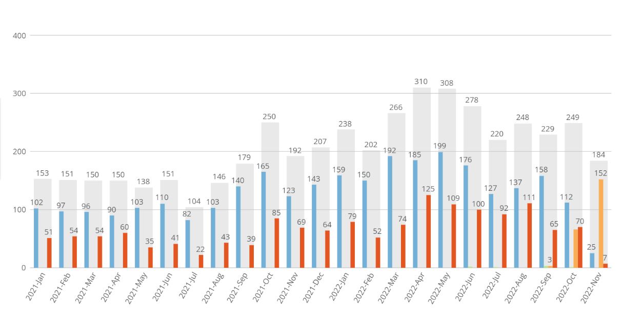
I'm trying to utilize the nested bar and line chart to determine to show how many of our signed staff actually start vs. drop out in onboarding. Currently, I have the chart as a nested bar and it works well but when I switch it to nested bar and line, I'm not able to achieve my goals. As some background, the current chart is:
- x axis is signed offer date over time
- y axis is count (employeeID)
- series is onboarding status (and the onboarding status fields are started, future start and did not start) which provides me 3 bars showing how many are in each.
The goal is to leave that chart intact but add a line overtop that is % dropout rate with the calculation being onboarding status=did not start divided by the total of the nested bar (i.e. started + did not did + future start).
If anyone has any ideas here, that would be greatly appreciated.
Thanks!
Answers
-
You could try something like this:
sum(case when `onboardingStatus` = 'did not start' then 1 else 0 end) / (sum(sum(case when `onboardingStatus` in ('started','did not start','future start') then 1 else 0 end)) over (partition by year(`signedOfferDate`), month(`signedOfferDate`)))
“There is a superhero in all of us, we just need the courage to put on the cape.” -Superman0 -
Hi - thanks for the reply. It did not work though. I've attached the formula and what the chart looks like using that formula. I also attached the baseline chart - that has everything except the dropout rate (line).
Any help would be greatly appreciated.
0 -
I think there's more than one thing going on, but I would start by playing with your sorts. I don't think you want a sort on Onboarding Conversion status, which is what's causing the duplicate dates across your x-axis.
Please 💡/💖/👍/😊 this post if you read it and found it helpful.
Please accept the answer if it solved your problem.
0


Categories
- All Categories
- 1.4K Product Ideas
- 1.4K Ideas Exchange
- 1.4K Connect
- 1.2K Connectors
- 284 Workbench
- 4 Cloud Amplifier
- 4 Federated
- 2.9K Transform
- 88 SQL DataFlows
- 554 Datasets
- 2.2K Magic ETL
- 3.3K Visualize
- 2.3K Charting
- 564 Beast Mode
- 9 App Studio
- 27 Variables
- 577 Automate
- 140 Apps
- 414 APIs & Domo Developer
- 22 Workflows
- 1 DomoAI
- 28 Predict
- 12 Jupyter Workspaces
- 16 R & Python Tiles
- 350 Distribute
- 90 Domo Everywhere
- 258 Scheduled Reports
- 2 Software Integrations
- 91 Manage
- 88 Governance & Security
- 9 Product Release Questions
- Community Forums
- 42 Getting Started
- 28 Community Member Introductions
- 85 Community Announcements
- 4.8K Archive