How to Create a Dynamic Period over Period Beast Mode in a Table

I have a table chart that I am trying to show the percent change in sales period over period. An example would be sales grew by 5% in June 2021 vs sales in May 2021. With this, I want to be able to dynamically select a date range to view different periods of time like "previous year" or "last 12 months". Any recommendations on how to handle this with a Beast Mode and present it in a table card format?
Other sales-related filters will be used on this card as well (suppliers, account numbers, etc.).
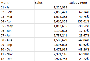
Example Data:
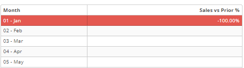
Screenshot of Example Card:
Thanks in advance for your help!
Answers
-
Hi @Eli_Rollins
I've done a writeup in the past about custom date offsets which will likely do what you're looking for. You can have a date and then have different offsets within that dataset. https://dojo.domo.com/discussion/53481/a-more-flexible-way-to-do-period-over-period-comparisons#latest
I'll also be presenting on this in two days at the Virtual User Group if you want more of a walk through.
**Was this post helpful? Click Agree or Like below**
**Did this solve your problem? Accept it as a solution!**1 -
@GrantSmith thank you for getting back so quickly. I will read through your write-up in the link.
0

Categories
- All Categories
- 1.4K Product Ideas
- 1.4K Ideas Exchange
- 1.4K Connect
- 1.1K Connectors
- 278 Workbench
- 4 Cloud Amplifier
- 4 Federated
- 2.7K Transform
- 89 SQL DataFlows
- 557 Datasets
- 2K Magic ETL
- 3.3K Visualize
- 2.3K Charting
- 571 Beast Mode
- 11 App Studio
- 27 Variables
- 579 Automate
- 141 Apps
- 414 APIs & Domo Developer
- 23 Workflows
- 1 DomoAI
- 28 Predict
- 12 Jupyter Workspaces
- 16 R & Python Tiles
- 352 Distribute
- 92 Domo Everywhere
- 258 Scheduled Reports
- 2 Software Integrations
- 92 Manage
- 89 Governance & Security
- 9 Product Release Questions
- Community Forums
- 42 Getting Started
- 28 Community Member Introductions
- 86 Community Announcements
- 4.8K Archive