Trend Line on a Bar Chart?

Is there a way to add a trendline to a grouped bar chart? I know that there is a chart option gor Grouped Bar +Line, but I'm stuck on what to do next.
Any help would be greatly appreciated!
Answers
-
@HowDoIDomo - Are you looking for a trendline for the total? Or are you expecting to see separate trend lines for each series in your grouped bar chart?
Also, would you want the trend line to respond to filters? or card interactions? In other words, let's assume we are graphing sales performance by region. The trendline would then be the overall performance of all of the areas. However, let's now assume that someone filters for only region east, so there is just one series. Would you want the trendline to adjust to only show the trend of the east, or would you expect then to be able to view the east performance as it compares to the global trend of sales?
I believe we can work through either of these scenarios, but we may need to make some changes in a dataflow depending on your expected behavior of the graph.
“There is a superhero in all of us, we just need the courage to put on the cape.” -Superman0 -
@ST_-Superman-_ Thanks for your response! I am looking at 2 options for the trendline based on what Domo can do.
1) If possible I would just want to show how the values have increased, decreased, or stayed the same overtime in a straight line instead of peaks and valleys.
or
2)I would like the line to be filtered to a previous year's data for comparison.
I saw that there was a video in Domo U for creating a regression line. However, I can't find the "regression line" button under chart properties. I'm not sure that would be relevant, though.
Am I making sense?
0 -
@HowDoIDomo , consider using a Bullet Chart if you don't want an actual line overlayed on a bar chart
There is a Period Over Period chart type to allow you to compare to the previous year of data.
I would be wary of the Regression b/c as soon as people start adding filters the results get misinterpreted (b/c it's limited to the filtered set of rows i.e. what's visible instead of the entire dataset.)
Jae Wilson
Check out my 🎥 Domo Training YouTube Channel 👨💻
**Say "Thanks" by clicking the ❤️ in the post that helped you.
**Please mark the post that solves your problem by clicking on "Accept as Solution"1 -
So, I have tried the period over period cart types, but haven't been able to get it to work. The thing is, I am trying to do two comparisons. First is our actual results to an expect standard:

And 2nd, this year's results vs. the previous year for comparison. Unfortunately, I've only been able to do one or the other as shown below:
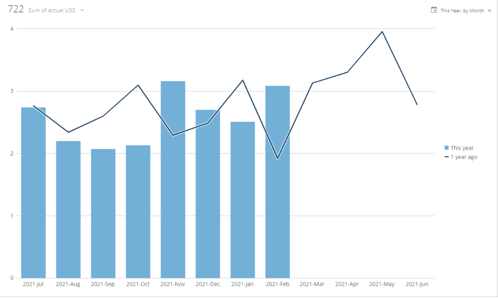
Am I missing a setting or using the wrong chart type? Or, is this just something I can't do?
Thank you @ST_-Superman-_ and @jaeW_at_Onyx for your help so far!
0 -
Hi @HowDoIDomo
I recommend Line + Grouped Bar Chart types of graphs. In the general section you can define the number of metrics or series which make up the line portion of the graph. By default it is just the first value going left to right. You’d need to calculate your differences from last year manually and I’d recommend using a date dimension table to have a comparison date and a report date. There’s several posts outlining this methodology on the dojo.
**Was this post helpful? Click Agree or Like below**
**Did this solve your problem? Accept it as a solution!**1 -
@GrantSmith I tried using the steps in other posts and keep getting error messages.
@jaeW_at_Onyx would your week-based data table youtube vid https://www.youtube.com/watch?v=UO9YUfkSh7I help with the above suggestion?
0 -
You want this video, https://www.youtube.com/watch?v=CDKNOmKClms&t=325s to build a period over period analysis without using the POP chart type.
Jae Wilson
Check out my 🎥 Domo Training YouTube Channel 👨💻
**Say "Thanks" by clicking the ❤️ in the post that helped you.
**Please mark the post that solves your problem by clicking on "Accept as Solution"0 -
Would you mind providing a fake dataset that would mimic your data's schema and would provide enough fake data for us to work with? I wouldn't mind taking a stab at this. I agree with @GrantSmith , I think you'll have the best luck with a grouped and stacked bar chart.
The issue with the regression line is that you can only have one series if you want to see the regression line. That may be feedback for Domo. A possible feature request where you can specify one series that you would like to see the regression line for even if there are other series present in the graph.
“There is a superhero in all of us, we just need the courage to put on the cape.” -Superman0 -
I tried searching for those posts, but I couldn't find any related to what I'm trying to do. That being said, I found one with a mysql code you wrote:
select d.`dt` as "Report Date", date_sub(`dt`, interval '0' year) as "Comparison Date", 'Current' as 'Period Type'
from `calendar_dates` d

UNION

select d.`dt` as "Report Date", date_sub(`dt`, interval '7' day) as "Comparison Date", 'Last Week' as 'Period Type'
from `calendar_dates` d

UNION

select d.`dt` as "Report Date", date_sub(`dt`, interval '1' month) as "Comparison Date", 'Last Month' as 'Period Type'
from `calendar_dates` d

UNION

select d.`dt` as "Report Date", date_sub(`dt`, interval '28' day) as "Comparison Date", '28 Days Ago' as 'Period Type'
from `calendar_dates` d

UNION

select d.`dt` as "Report Date", date_sub(`dt`, interval '364' day) as "Comparison Date", 'Last Year (DOW Aligned)' as 'Period Type'
from `calendar_dates` d

UNION

select d.`dt` as "Report Date", date_sub(`dt`, interval '1' year) as "Comparison Date", 'Last Year' as 'Period Type'
from `calendar_dates` d

UNION

select d.`dt` as "Report Date", date_sub(`dt`, interval '2' year) as "Comparison Date", '2 Years Ago' as 'Period Type'
from `calendar_dates` d

UNION

select d.`dt` as "Report Date", date_sub(`dt`, interval '728' day) as "Comparison Date", '2 Years Ago (DOW Aligned)' as 'Period Type'
from `calendar_dates` d

UNION

select d.`dt` as "Report Date", date_sub(`dt`, interval '3' year) as "Comparison Date", '3 Years Ago' as 'Period Type'
from `calendar_dates` d

UNION

select d.`dt` as "Report Date", date_sub(`dt`, interval '1,092' day) as "Comparison Date", '3 Years Ago (DOW Aligned)' as 'Period Type'
from `calendar_dates` d

UNION

select d.`dt` as "Report Date", date_sub(`dt`, interval '1' quarter) as "Comparison Date", 'Last Quarter' as 'Period Type'
from `calendar_dates` d
Every time I use this, I get an error whether I use the 'calendar dates' or 'end dates' which is the actual date column name i have in the spreadsheet. What am I doing wrong?
0 -
That code is for a MySQL dataflow which will generate the date dimension table for you but it's built off of the Domo Date Dimension table. You can find the Domo Dimensions connector in the Cloud App lists for data connectors. Then select the dates dimension and give it a name. In my case I called it Calendar Dates. I used that as the input dataset in my MySQL dataflow with the alias "calendar_dates"
Once you have that base offset dataset built you can then follow those steps that @jaeW_at_Onyx outlined in his video of joining the data together using a View (or Fusion)
**Was this post helpful? Click Agree or Like below**
**Did this solve your problem? Accept it as a solution!**1


Categories
- All Categories
- 1.4K Product Ideas
- 1.4K Ideas Exchange
- 1.4K Connect
- 1.2K Connectors
- 284 Workbench
- 4 Cloud Amplifier
- 4 Federated
- 2.9K Transform
- 88 SQL DataFlows
- 554 Datasets
- 2.2K Magic ETL
- 3.3K Visualize
- 2.3K Charting
- 564 Beast Mode
- 9 App Studio
- 27 Variables
- 577 Automate
- 140 Apps
- 414 APIs & Domo Developer
- 22 Workflows
- 1 DomoAI
- 28 Predict
- 12 Jupyter Workspaces
- 16 R & Python Tiles
- 350 Distribute
- 90 Domo Everywhere
- 258 Scheduled Reports
- 2 Software Integrations
- 91 Manage
- 88 Governance & Security
- 9 Product Release Questions
- Community Forums
- 42 Getting Started
- 28 Community Member Introductions
- 85 Community Announcements
- 4.8K Archive