Bar Chart - side-by-side comparison of category average and individual item?

Hello All,
I'm interested in building the following type of graphic.
Let's say I have a category such as 'Truck' and want to calculate the average cost for all categories 'Truck'.
And let's say I would like to have a side-by-side comparison of that average compared to a particular 'Truck'.
I'm having a tough time achieving this without hardcoding values.
Any advice would be appreciated.
Comments
-
You can do this easily in Magic ETL. It would look something like this.
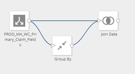
Perform a group by of all trucks to get the totals.
Join it back to your main dataset. You will then have that All Trucks total next to your individual truck total as another column.
**Check out my Domo Tips & Tricks Videos
**Make sure to any users posts that helped you.
**Please mark as accepted the ones who solved your issue.1 -
Instead of JOIN'ing the data as @Mark proposes, I would APPEND the data to itself. Then replace the "TruckID" value with "Truck_Total"
this way your dataset will still respond to filters and you don't have to do weird math.
sum(case when truck_id <> 'truck_total' then amount end) / sum(case when truck_id = 'truck_total' then amount end)
Jae Wilson
Check out my 🎥 Domo Training YouTube Channel 👨💻
**Say "Thanks" by clicking the ❤️ in the post that helped you.
**Please mark the post that solves your problem by clicking on "Accept as Solution"1 -
Great thanks for the responses guys. I'll give it a shot!
1


Categories
- All Categories
- 1.4K Product Ideas
- 1.4K Ideas Exchange
- 1.4K Connect
- 1.2K Connectors
- 284 Workbench
- 4 Cloud Amplifier
- 4 Federated
- 2.9K Transform
- 88 SQL DataFlows
- 554 Datasets
- 2.2K Magic ETL
- 3.3K Visualize
- 2.3K Charting
- 564 Beast Mode
- 9 App Studio
- 27 Variables
- 577 Automate
- 140 Apps
- 414 APIs & Domo Developer
- 22 Workflows
- 1 DomoAI
- 28 Predict
- 12 Jupyter Workspaces
- 16 R & Python Tiles
- 350 Distribute
- 90 Domo Everywhere
- 258 Scheduled Reports
- 2 Software Integrations
- 91 Manage
- 88 Governance & Security
- 9 Product Release Questions
- Community Forums
- 42 Getting Started
- 28 Community Member Introductions
- 85 Community Announcements
- 4.8K Archive