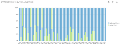
Percent comparison chart with more than 100%
I hope I explain this correctly. I am trying to get a stacked chart where my field 'Estimated Hours' = 100% and my 'Actual Hours' is a percentage of 'Estimated Hours'. The Estimated Hours field has different values across the chart so I didn't think they'd all be even at the top. I'd also like to show it where if the Actual Hours is less than the Estimated, that the actual will show as green but if it is more than the estimated, that the amount above the 100% line shows as red. I've tried a few different charts for this. I'm attaching images of what I currently have but I know its wrong. Can someone point me in the right direction?


Comments
-
Is anyone able to help out with this request?
0 -
Hi jlazerus,
I think an easier way to go would be to use a Grouped Bar Card, with one column being the Estimated Hours, and the second being Actual Hours, that way when viewing the card, it will quickly be apparent if the actual hours are larger or smaller than the Estimated Hours.
As well, you will need to write a BeastMode to be able to make the Color Rule work properly. An example of this beast mode would be:
CASE
WHEN
`Actual Hours` > `Estimated Hours`THEN 1
ELSE 0
END
Then in the Color Rule, if (BeastMode Name) is 1, then Red, otherwise Green.
I hope that helps you with this card!
Josh Thorn
DOMO Support
0
Categories
- All Categories
- 1.4K Product Ideas
- 1.4K Ideas Exchange
- 1.4K Connect
- 1.2K Connectors
- 284 Workbench
- 4 Cloud Amplifier
- 4 Federated
- 2.9K Transform
- 88 SQL DataFlows
- 554 Datasets
- 2.2K Magic ETL
- 3.3K Visualize
- 2.3K Charting
- 563 Beast Mode
- 9 App Studio
- 27 Variables
- 577 Automate
- 140 Apps
- 414 APIs & Domo Developer
- 22 Workflows
- 1 DomoAI
- 28 Predict
- 12 Jupyter Workspaces
- 16 R & Python Tiles
- 350 Distribute
- 90 Domo Everywhere
- 258 Scheduled Reports
- 2 Software Integrations
- 91 Manage
- 88 Governance & Security
- 9 Product Release Questions
- Community Forums
- 42 Getting Started
- 28 Community Member Introductions
- 85 Community Announcements
- 4.8K Archive