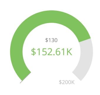
Building card with monthly sales targets - target-to-date
I'm fairly new to domo and am really struggling with something that seems pretty simple.
I just want to create a bar chart with our monthly sales over the year but have a running line graph showing where we are in terms of target-to-date
Example. If our monthly target is $17,000 how do I get that line to double in Feb, triple in Mar, etc.?
I've only been able to graph a straight line across and have the month's total in the graph.

Another option would be a gauge but I can't seem to figure out where I'm getting $130 as my target in dark grey...or how to get it to show where I am to date. (if I'm 8.5% above my target, i would want a line or something to show that I'm exceeding it currently)

Best Answer
-
Try syncing your scales on Chart Properties/General/ Sync Value Scales

Hope this helps, please do ask if you need more help with this.
Ricardo Granada
MajorDomo@Lusiaves
**If the post solves your problem, mark it by clicking on "Accept as Solution"
**You can say "Thank you" by clicking the thumbs up in the post that helped you.0
Answers
-
Hi,
I think in your case you should use a Line + Stacked Bar.
Some more info on that:http://knowledge.domo.com?cid=stackedbarwithline
Then add another category for your target with the following Beast Mode:
MONTH(`Date_Field`) * `Monthly_Target`
Hope this helps, please do ask if you need more help with this.
Ricardo Granada
MajorDomo@Lusiaves
**If the post solves your problem, mark it by clicking on "Accept as Solution"
**You can say "Thank you" by clicking the thumbs up in the post that helped you.1 -
Thank you. I did as you suggested and it seems to have worked. Only problem is that the scale of my graph seems to be off.
If you see below, two points on my graph are being represented at similar heights but different values....

 0
0 -
Try syncing your scales on Chart Properties/General/ Sync Value Scales

Hope this helps, please do ask if you need more help with this.
Ricardo Granada
MajorDomo@Lusiaves
**If the post solves your problem, mark it by clicking on "Accept as Solution"
**You can say "Thank you" by clicking the thumbs up in the post that helped you.0 -
THANK YOU!
0
Categories
- All Categories
- 1.4K Product Ideas
- 1.4K Ideas Exchange
- 1.4K Connect
- 1.2K Connectors
- 284 Workbench
- 4 Cloud Amplifier
- 4 Federated
- 2.9K Transform
- 88 SQL DataFlows
- 554 Datasets
- 2.2K Magic ETL
- 3.3K Visualize
- 2.3K Charting
- 564 Beast Mode
- 9 App Studio
- 27 Variables
- 577 Automate
- 140 Apps
- 414 APIs & Domo Developer
- 22 Workflows
- 1 DomoAI
- 28 Predict
- 12 Jupyter Workspaces
- 16 R & Python Tiles
- 350 Distribute
- 90 Domo Everywhere
- 258 Scheduled Reports
- 2 Software Integrations
- 91 Manage
- 88 Governance & Security
- 9 Product Release Questions
- Community Forums
- 42 Getting Started
- 28 Community Member Introductions
- 85 Community Announcements
- 4.8K Archive
